Learning Journey: Working with Content Hub
If you followed along with our tutorial on how to make your news story, then you’ll notice we entirely ignored the Customize Page tab. If you want to make your article more appealing, you can add elements to your article on that page to better attract people to your content.
Key Page Elements

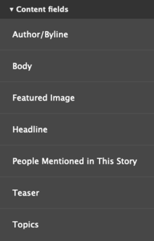
First and foremost, let’s go over the key components of this page. The Body Text block is your article’s content. Do not remove this! It is key to having your content display on the page. The related topics and people mentioned boxes are there to display things related to your article. These can go either below the article or in the sidebar.
Setting up a Sidebar
By default, news articles have a fixed 30%/70% two-column layout. However, if desired, this can be changed to a 70%/30% or 50%/50% layout. As the main article and its connected content is stored in fielded data, you cannot break up the content of the article between columns. However, you can use this to set up a sidebar for your article that contains related information.
If you wish to have a left-side sidebar, you don't have to do anything to your page layout. By default, all news articles will place the sidebar there. However, a left-hand sidebar places its content above the article on a mobile screen. That isn't always the most beneficial layout. To have the content go below your article on mobile, you will need to use a right-handed sidebar, which takes some setup.

Making a right-hand sidebar
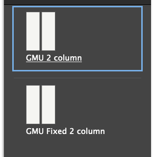
Access your article from the Customize Page tab to view your options. Select "Add Section." You will be presented with two options: GMU 2 column and GMU Fixed 2 column. To change the setup for a right-hand sidebar, you will need to select the other 2-column option. Select 70%/30% as the column setup.
Now, with your new section added, you will need to move your article content up. Drag and drop, or use the move option, to position your blocks as you wish in the new section. When you are done, you can remove the old section from the page layout. Make sure to save it when you are done!
Sidebar Content
A sidebar is a good place for images with connected links and information, contact information, and related articles. You don’t want to overload the sidebar too much but sometimes a message is best delivered with some supporting information that can only be achieved via extra blocks.
One everyday use for the sidebar is to show a call-to-action button. Events needing registration, stories connected to admissions, or similar situations can all benefit from a call-to-action button. Depending on how you want to format the article, you could place this button either in the sidebar or at the bottom of the page below the article.
Basic Text boxes can be used to house general information, such as contact information for an office or topic contact. Make sure you format this content clearly to communicate the information well.
A featured image will be cramped in the sidebar, but using one with some caption text can create visual appeal in specific use cases. Just remember the image will look much larger on mobile!
Using the news article feed to show related articles is often a good way to showcase Mason's excellence in a particular field or topic area. Filter the topics to use the same or similar tags to the ones placed on your article. Just be aware this list will change based on the site the article is displayed on. Sites only display articles shared with them using those tags, so a topic that has a lengthy article list on the main Mason site might only have one or two on a specific office's site. Check how your article looks in multiple contexts!
